Relaxing Colors for Home
Relaxing colors for home don’t mean boring beige! Vibrant, cozy hues that soothe your soul & make your space feel like a dream retreat.
You know how people always say, “If you want a relaxing home, just paint everything beige”?
Like, beige… Really?
Who decided that beige was the ultimate chill color? Beige feels like the color equivalent of small talk at a networking event… it’s fine, but it’s not gonna make you want to kick off your shoes and melt into the couch.
And don’t even get me started on all those Pinterest-perfect living rooms that look like they’re auditioning for a guest role on a soap opera.
So, if you’ve been brainwashed into thinking that “relaxing colors” mean boring neutrals, I’m here to set the record straight.
What you actually want is a home that makes you go “ooooh” when you walk in. A space that doesn’t just look nice but feels good. Like, “I just got a massage, sipped a glass of wine, and found a $20 in my pocket” kind of good.
The problem? Picking colors is like speed dating. You’ve got a million choices, everyone’s got an opinion, and you’re terrified of committing to the wrong one. But don’t stress. I’ve got you covered.
Let’s talk about how to choose relaxing colors for your home without it feeling like a decision that belongs on a philosophy exam.
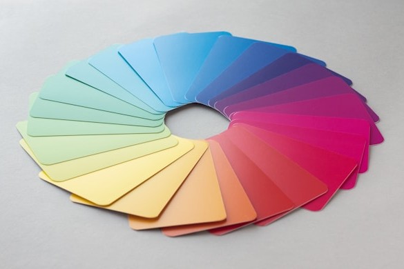
Myth Busting: Relaxation Doesn’t Equal Neutrals
First off, let’s put this myth to bed. Relaxation isn’t a beige monopoly. Sure, neutrals have their place, but saying neutrals are the only way to relax is like saying the only way to stay warm is with a plain, scratchy wool blanket. There’s so much more out there!
Relaxing colors are about what makes you feel calm. And guess what? That’s not the same for everyone.
Maybe soft greens make you feel like you’re lying under a big ol’ tree on a breezy day. Or maybe it’s a dusty lavender that reminds you of a spa, you know, the kind with cucumber water that tastes fancier than it should.
Here’s the tea: color psychology is a thing, but it’s not the whole thing.
Blues are often dubbed “relaxing” because they’re associated with the sky and sea, but if blue gives you flashbacks to that one dentist office with the “soothing” ocean mural, then it’s not your vibe.
Trust your gut, and your eyeballs.
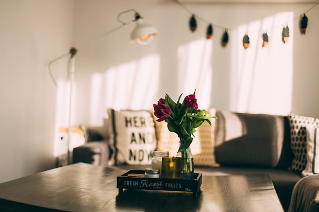
The Power of Pastels (Yes, They’re Back)
So, let’s talk pastels. Not the Easter-egg, candy-store overload, but the muted, grown-up versions that look like they’ve been lounging in the sun. Think soft blush pinks, buttery yellows, and sage greens that practically whisper, “Hey, it’s all good.”
These shades are calming because they’re light and airy without being boring. They’re like your favorite pair of broken-in jeans… effortless.
Picture this: a pale peach wall in your bedroom, paired with crisp white linens and a terracotta throw blanket. It’s warm without being loud, like a hug but make it stylish.
Or maybe a soft robin’s egg blue in the bathroom. You’ll feel like you’re in a boutique hotel every time you brush your teeth. Who doesn’t want that?
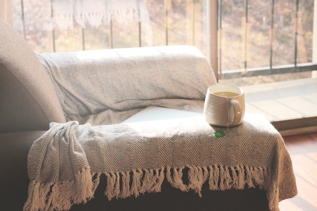
Moody But Make It Cozy
Now, if pastels aren’t your jam and you’re more about the dark, mysterious vibe, think rich, moody tones. Deep forest green, navy blue, charcoal gray.
These colors feel like wrapping yourself in a plush velvet robe, holding a cup of hot cocoa, and saying, “Yeah, I’m fancy now.” They’re grounding, which makes them super relaxing, especially in spaces where you want to unwind, like a bedroom or den.
But there’s a trick to making dark colors work without turning your house into a cave. Pair them with textures and light accents.
Got a navy wall? Add some creamy white curtains and a chunky knit throw.
Forest green room? Throw in a jute rug and some gold accents. It’s all about balance, like adding a splash of milk to your coffee.
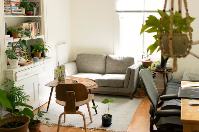
Earth Tones: Nature’s Chill Palette
Let’s not forget about earth tones, the timeless heroes of relaxing decor. Think clay reds, sandy taupes, olive greens, and warm browns. These colors connect us to nature, which is scientifically proven to chill you out. Plus, they’re super versatile.
A terracotta accent wall in the dining room? Yes, please. How about a soft olive-green sofa that feels like you’re sitting in a meadow? I’ll take two, please!
If you’re worried about going too “granola,” don’t.
Earth tones don’t have to mean your house looks like a pottery studio. They’re neutral enough to work with almost anything, so you can add pops of color or metallics for contrast. It’s like wearing a great pair of boots that go with everything.
Go Bold (But Just a Little)
Okay, hear me out: sometimes a bold color can be relaxing if it’s done right. Think of a rich mustard yellow that’s more “sunny afternoon” than “screaming emoji.” Or a jewel-toned teal that feels like a cozy library.
The key is to use these colors sparingly… an accent wall, a piece of furniture, or even just some throw pillows. They add energy without overwhelming, like the perfect soundtrack for a fun night in.
Test Drive Your Colors
Before you commit to painting an entire wall (or, heaven forbid, an entire room), test your colors.
Paint a big swatch on the wall and live with it for a few days. See how it looks in different lights… morning sun, evening glow, and that weird gray midday light.
Colors can change a lot depending on the light, and what feels relaxing at 10 a.m. might feel like a mistake at 10 p.m. Trust me, been there.
Relaxing Colors for Home Wrap Up (But Not Like a Burrito)
So, there you have it. The relaxing colors for your home don’t have to be boring, beige, or basic. Whether you’re into pastels, moody tones, earthy vibes, or bold accents, the key is finding what makes you feel good.
Your home should be your sanctuary, not a beige box that looks like it belongs in a catalog.